Federação Portuguesa de Futebol
Kicking off a new era for Portuguese football: FPF’s design system, rebuilt on the new corporate brand launching after the World Cup.

The challenge
The Federação Portuguesa de Futebol was getting a new corporate brand, set to launch after the World Cup. Its design system was already up and running, with components, tokens and documentation built since its first release in 2024, so the job wasn’t to start from scratch.
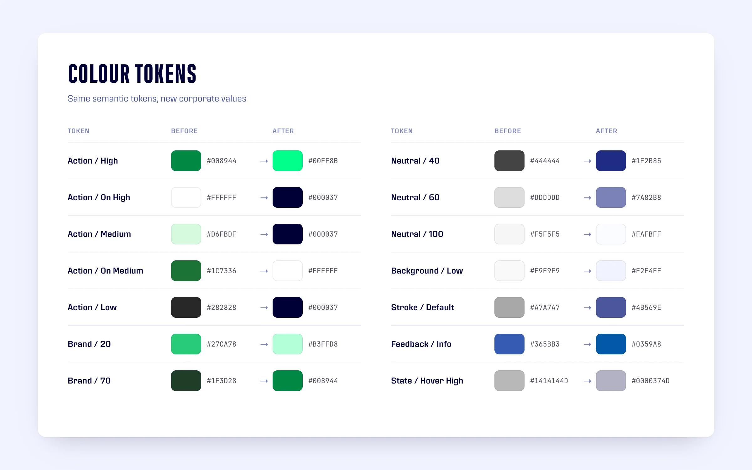
The challenge was to bring the new identity into the system that already existed: new colours, new typefaces and a new look and feel across every component, while keeping the structure, tokens and documentation the teams were already working with.
The role
I redesigned the system’s components for the new corporate brand. My tasks included:
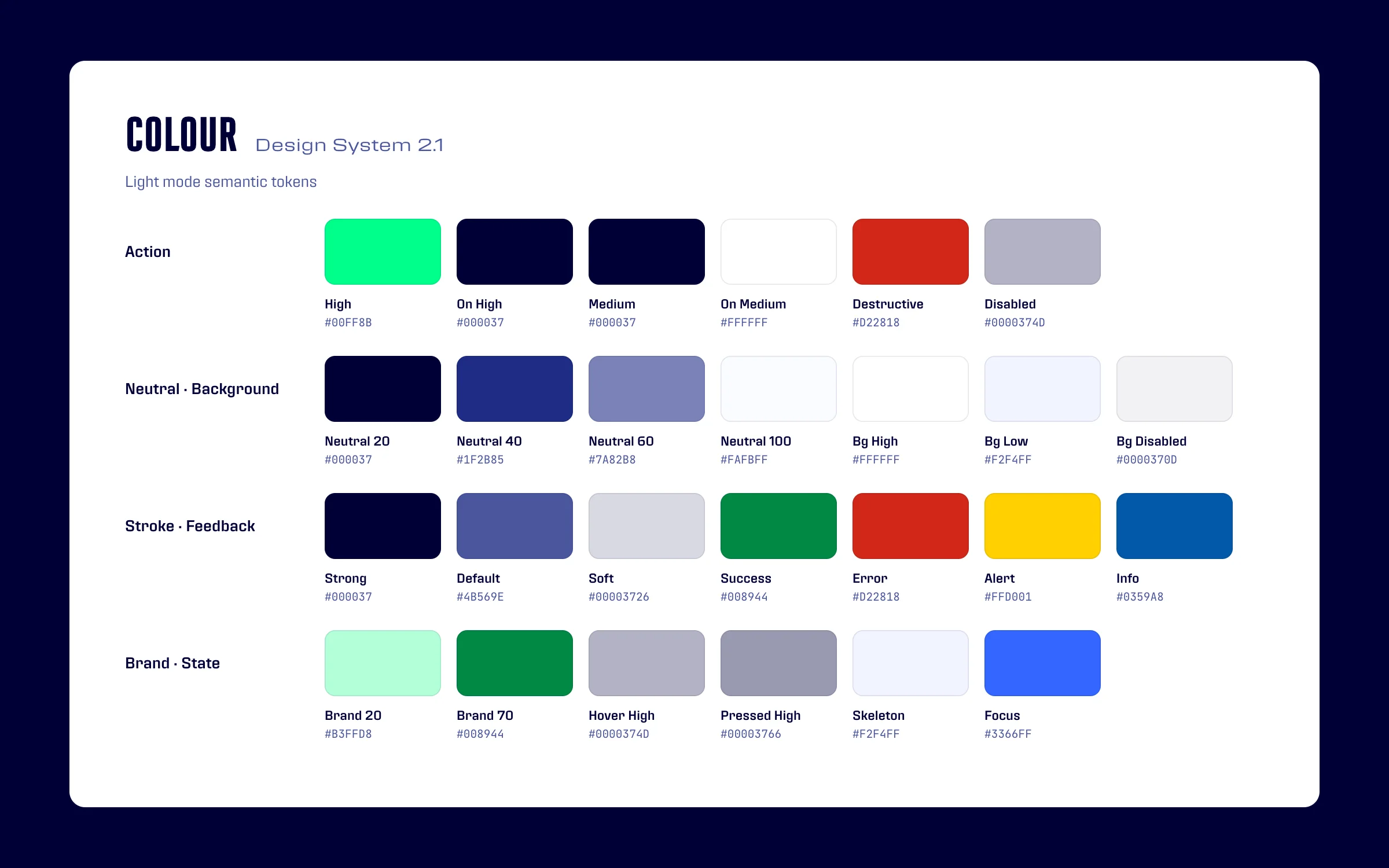
- Updating the colours from the system that already existed: new primitive palettes, semantic tokens with the new corporate colours, and palettes for dark mode and contrast themes.
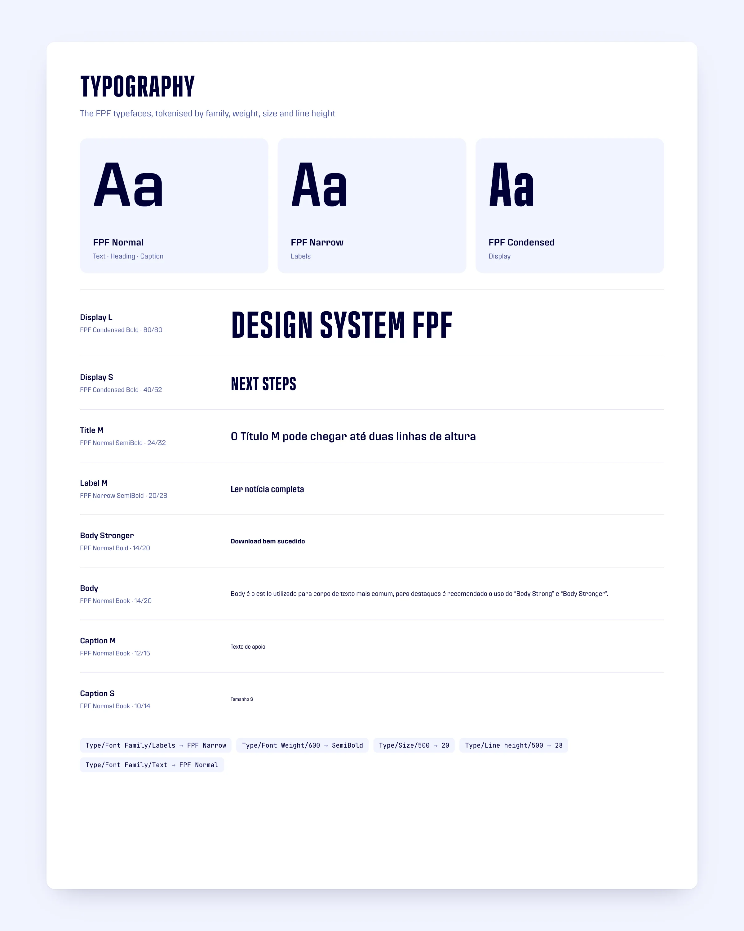
- Bringing the FPF typefaces into the text styles, with tokens for font family and font weight.
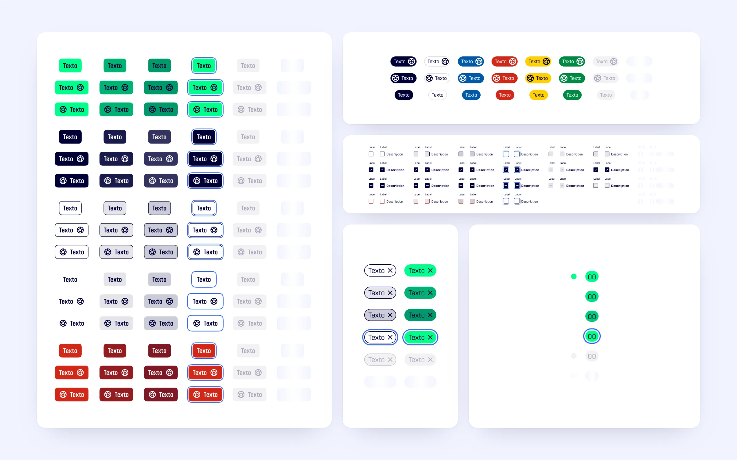
- Updating the UI specifications of every component: colours, interactive states and new focus, disabled and skeleton states.
- Revising the look and feel and the documentation, from the token tables to the usage examples.
The solution
Design System 2.1: the same system, rebuilt on the new brand.
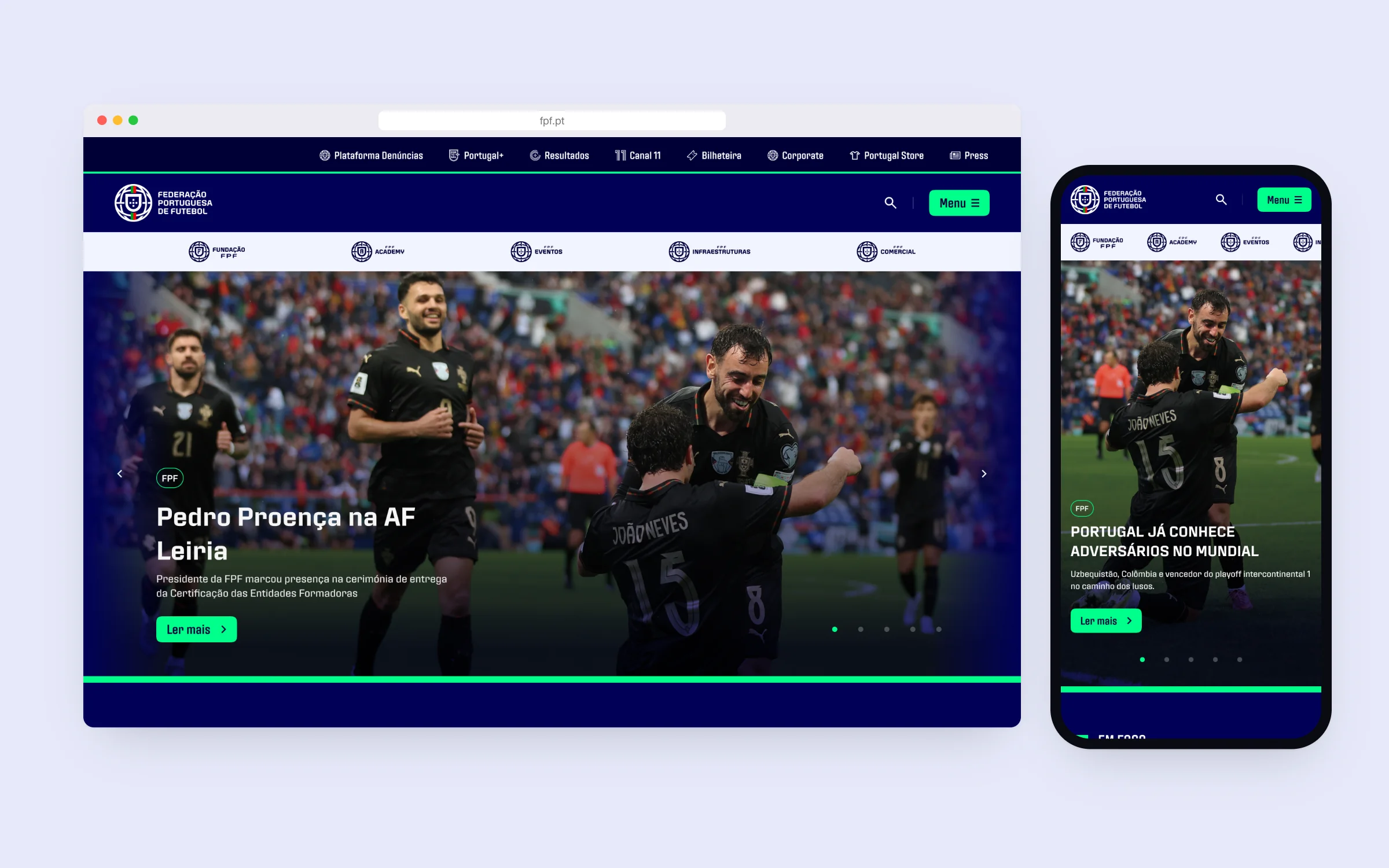
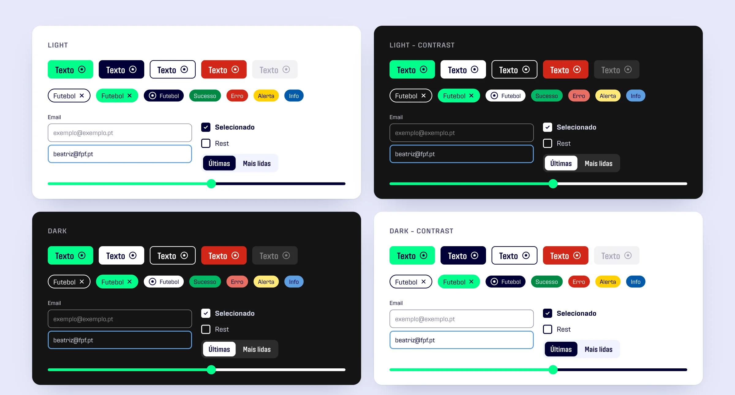
- Colour: the semantic tokens keep their roles while their values move to the new corporate palette. The green actions become a bright green on deep navy, and the greys become blue-tinted neutrals.
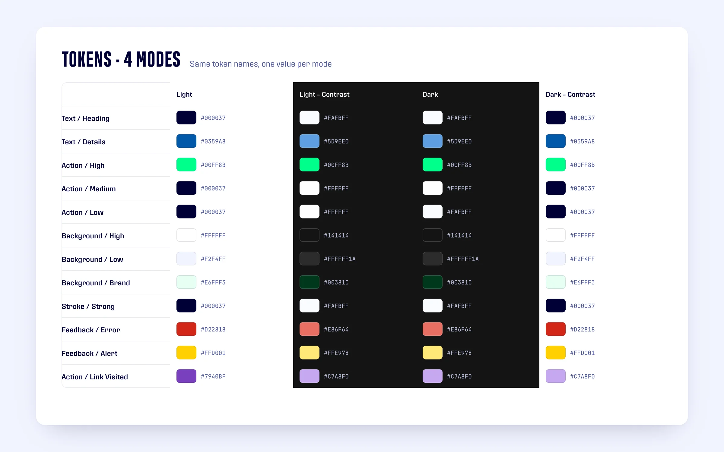
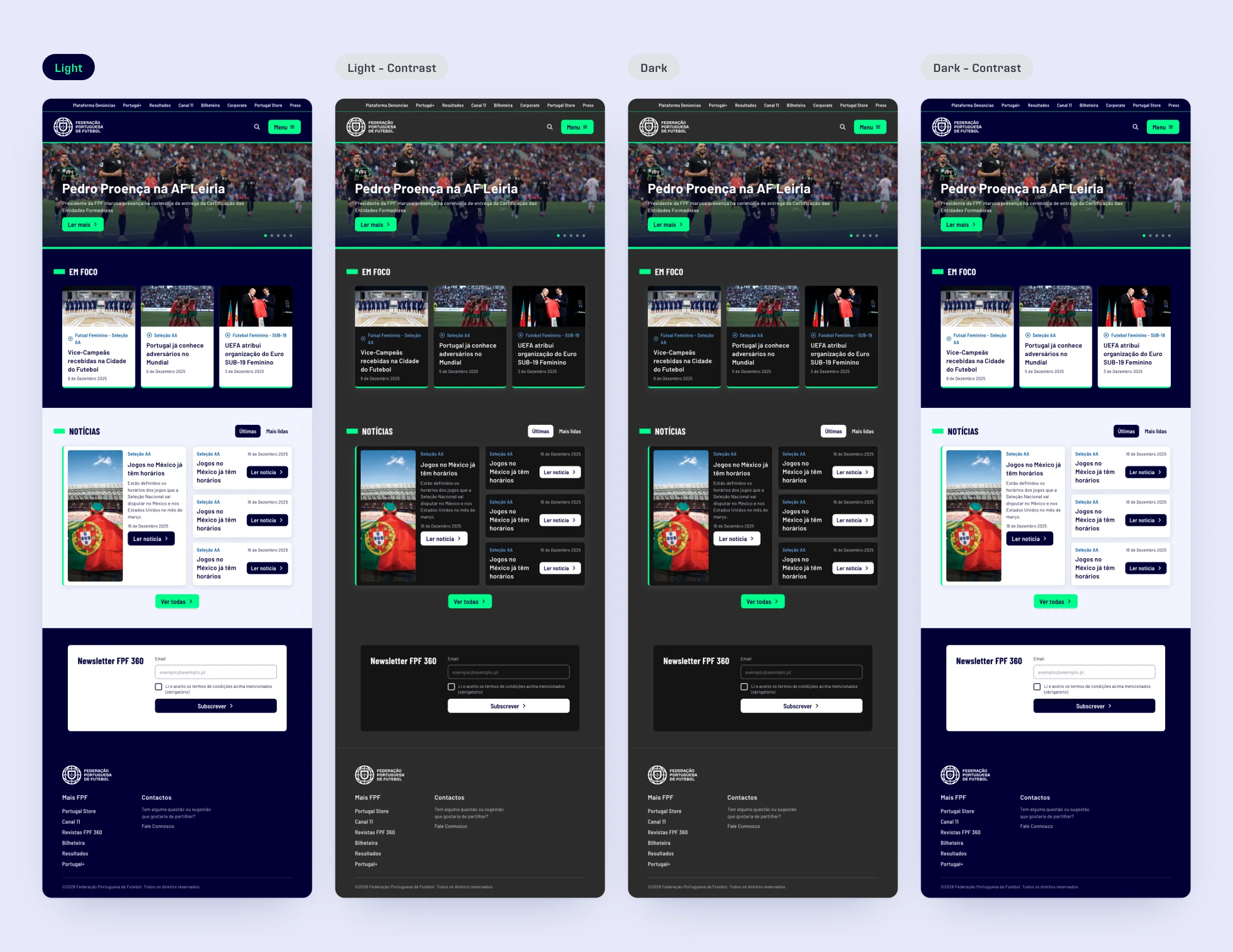
- Modes: every semantic token has a value for Light, Light - Contrast, Dark and Dark - Contrast, so the same components and pages switch theme without being redrawn.
- Typography: FPF Normal, FPF Narrow and FPF Condensed replace Inter and Barlow Condensed, with family, weight, size and line height as tokens.
- Components: buttons, tags, badges, checkboxes, sliders and the rest of the library updated to the new look and feel, with focus, disabled and skeleton states, and a new Dot Counter for notification dots and counts.
- Documentation: specification pages and token tables updated to the new names and values.
The impact
FPF’s design system was ready for the new brand without starting over.
- One system carrying the new corporate identity, built on the foundations that were already there.
- Colour and type defined as tokens, with light, dark and contrast modes.
- Updated specifications and documentation for the components that changed.
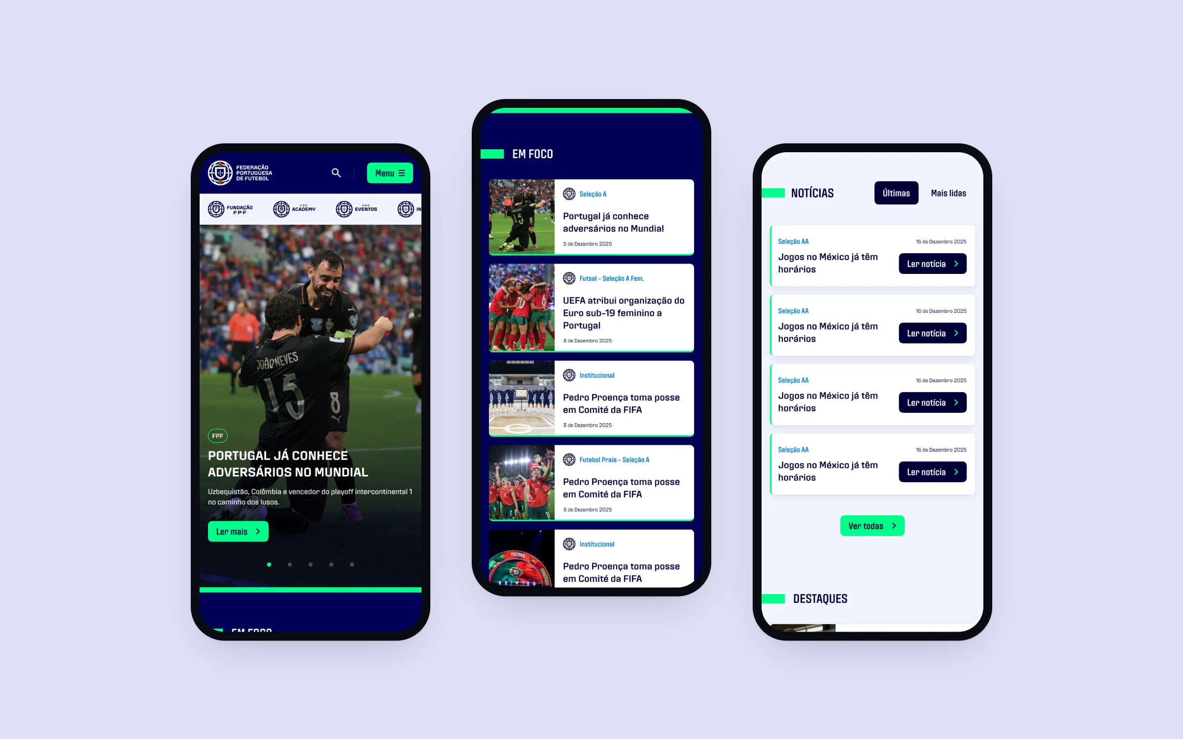
- Pages like the new FPF home page built from the same components, on desktop and mobile.
- Clear next steps for the system’s evolution across FPF’s platforms.
What clients say
Real feedback from amazing clients I've worked with

“Thank you for all your hard work so far, we really are so happy working with you. You have brought our idea to life and it looks amazing, we always get compliments of how great the UI looks. Looking forward to carrying on the journey.”
CEO and Co-Founder @ Festy
Featured In
Some of the talks, workshops and creative explorations I've contributed to
Each experience is designed to inspire and foster innovation, showcasing my passion for design and collaboration.