Bumble
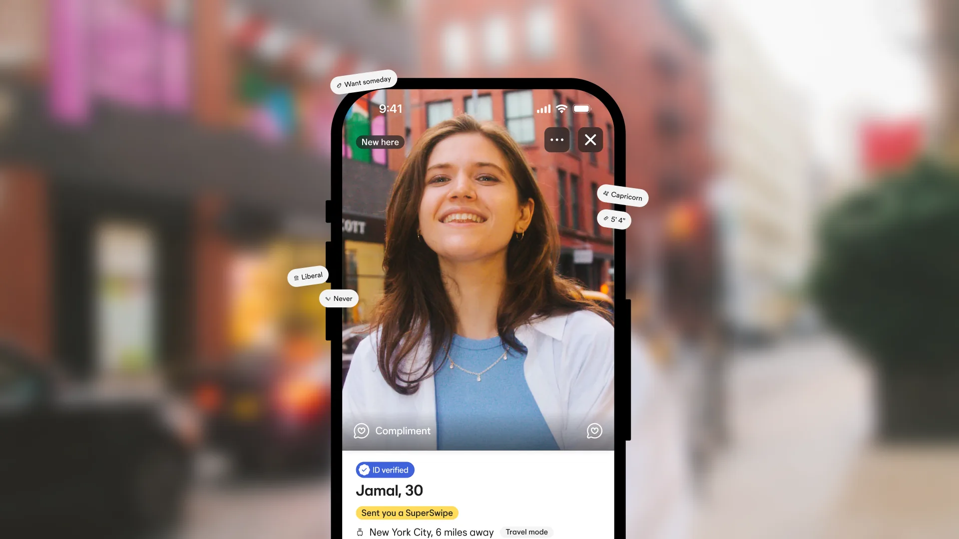
Powering every swipe with a human, warm, and inclusive design system that unites products and experiences.
Role
Senior Systems Designer
Skills
Design Systems
Design Tokens
Documentation
Year
2022–2025
Link
Go to link
The challenge
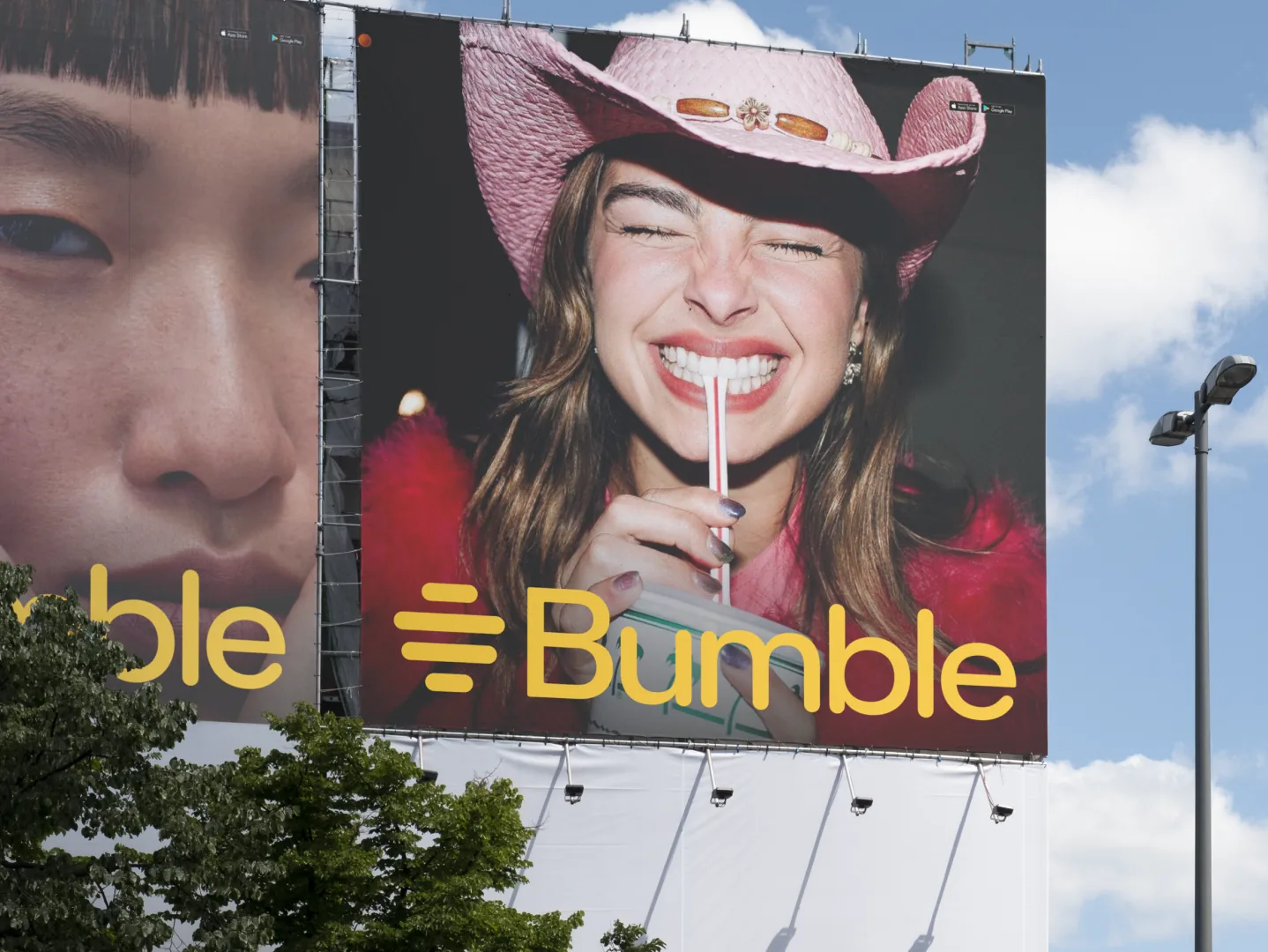
Bumble was undergoing a major rebranding effort, evolving its visual identity and product experience to reflect a more inclusive, warm, and human-centered brand. At the same time, its design system was fragmented, outdated in some areas, and lacked consistent documentation and standards to support both the new brand vision and the needs of designers and engineers working at scale. This led to inefficiencies, duplicated efforts, and inconsistent user experiences across platforms. The challenge was to rebuild the design system in a way that captured the refreshed Bumble identity, standardized design and development practices, and could scale globally while supporting multiple platforms (iOS, Android, and web).
The role
As a core contributor to Bumble’s design system, I played a central role in creating Cosmos 3.0, Bumble’s design system, and aligning it with the broader rebrand initiative. My responsibilities included:
- Auditing and cleaning up legacy Figma files and components.
- Defining and documenting standards, usage guidelines, and best practices.
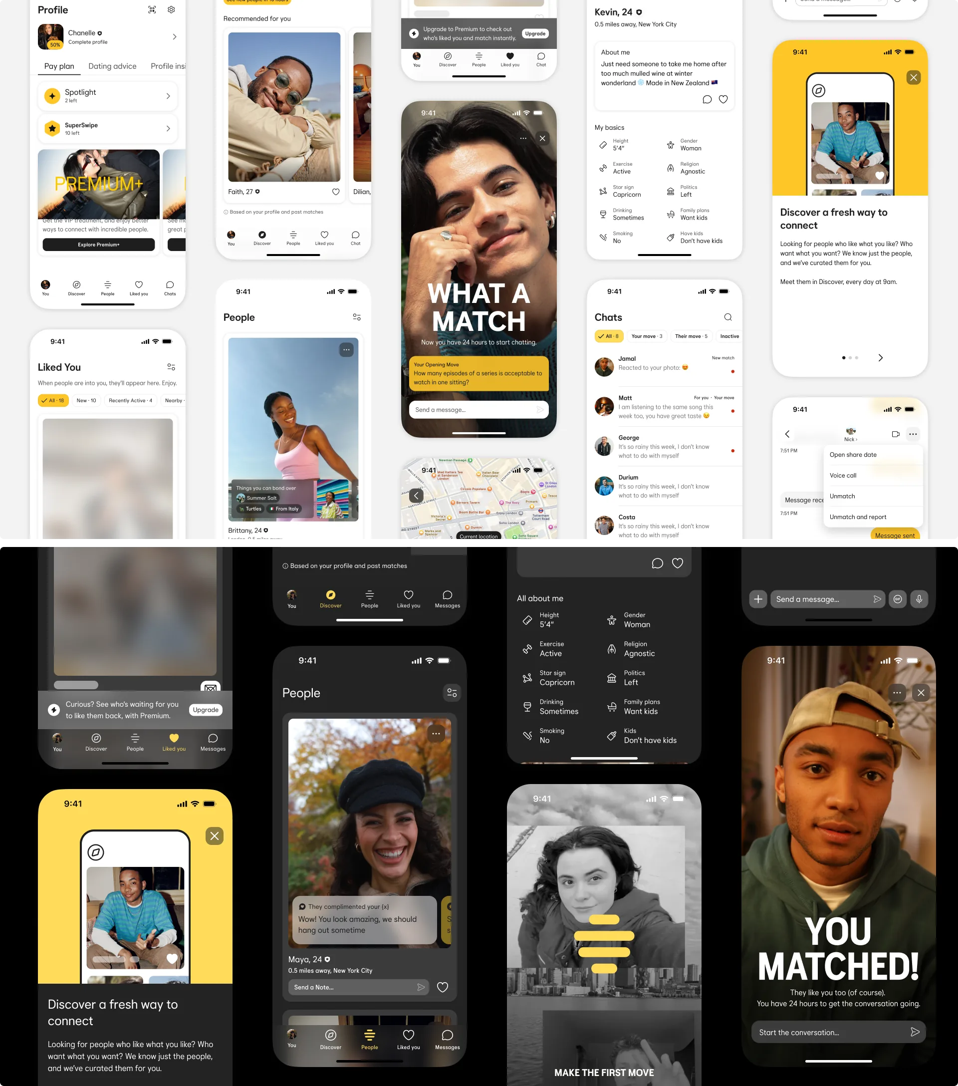
- Building new modular, themeable components that embodied Bumble’s refreshed brand attributes (human, warm, inclusive).
- Introducing robust design tokens to support light/dark modes and improve theming flexibility.
- Leading cross-functional collaboration with engineering to ensure design-development alignment and implementation accuracy.
- Developing accessible and scalable documentation to ensure adoption across global product teams.
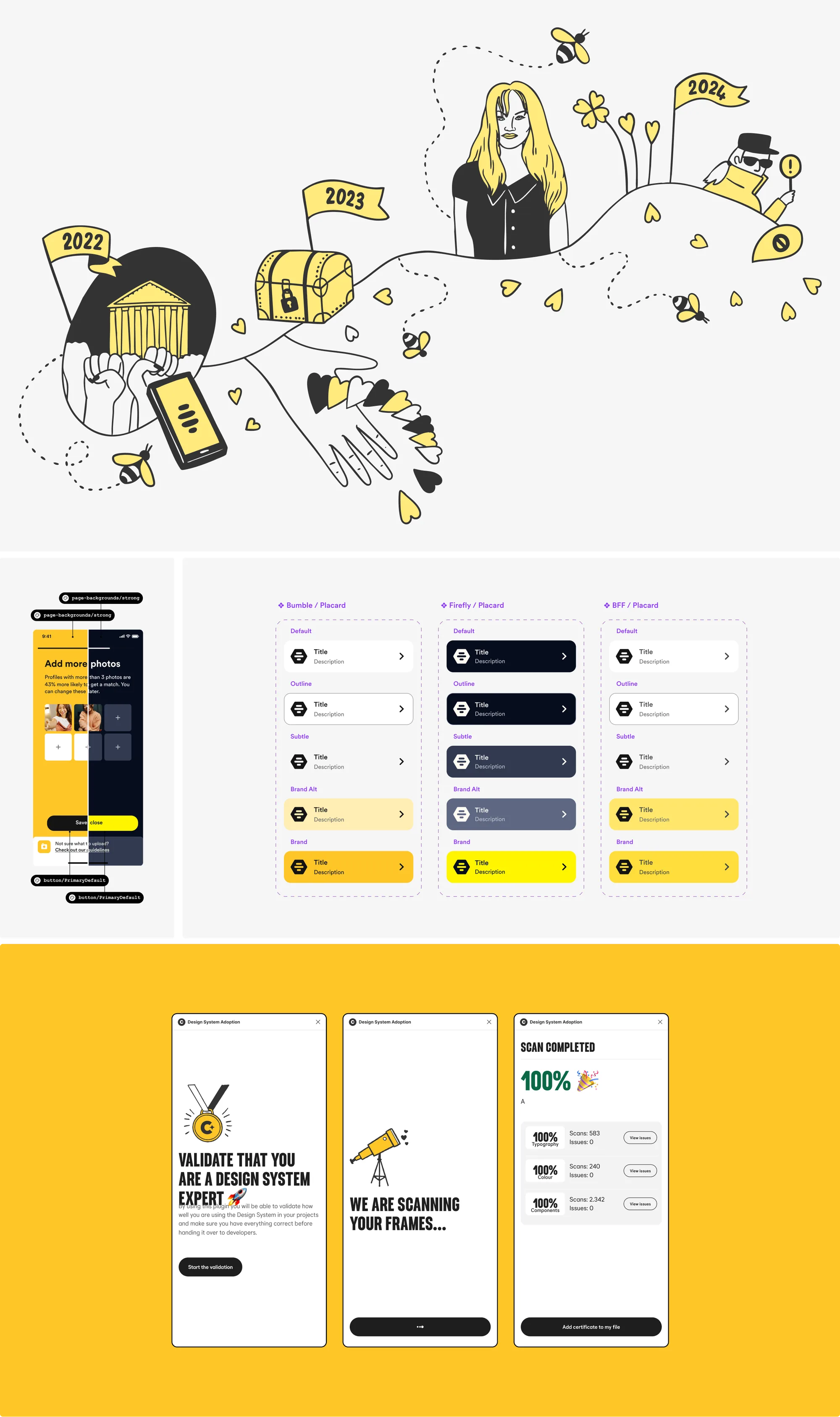
- Defining and tracking design system metrics to measure adoption, usage, and quality, helping us understand how components were being used in practice and identify areas where additional support or iteration was needed.
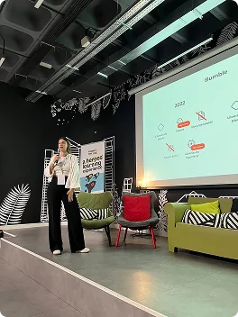
If you want to know more about metrics on Bumble's Design System check this presentation.
The solution
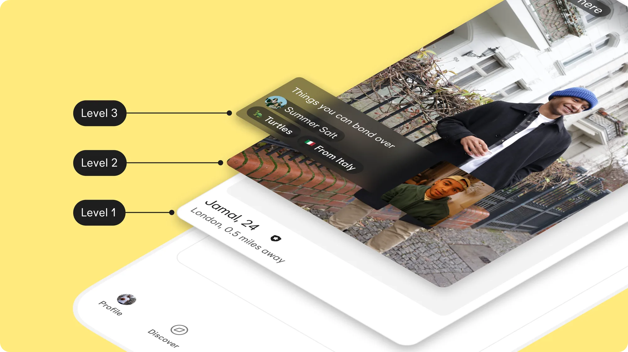
The solution was Project Love, a fully rebuilt and modernized project tightly integrated with Bumble’s new brand expression. Key aspects of the solution included:
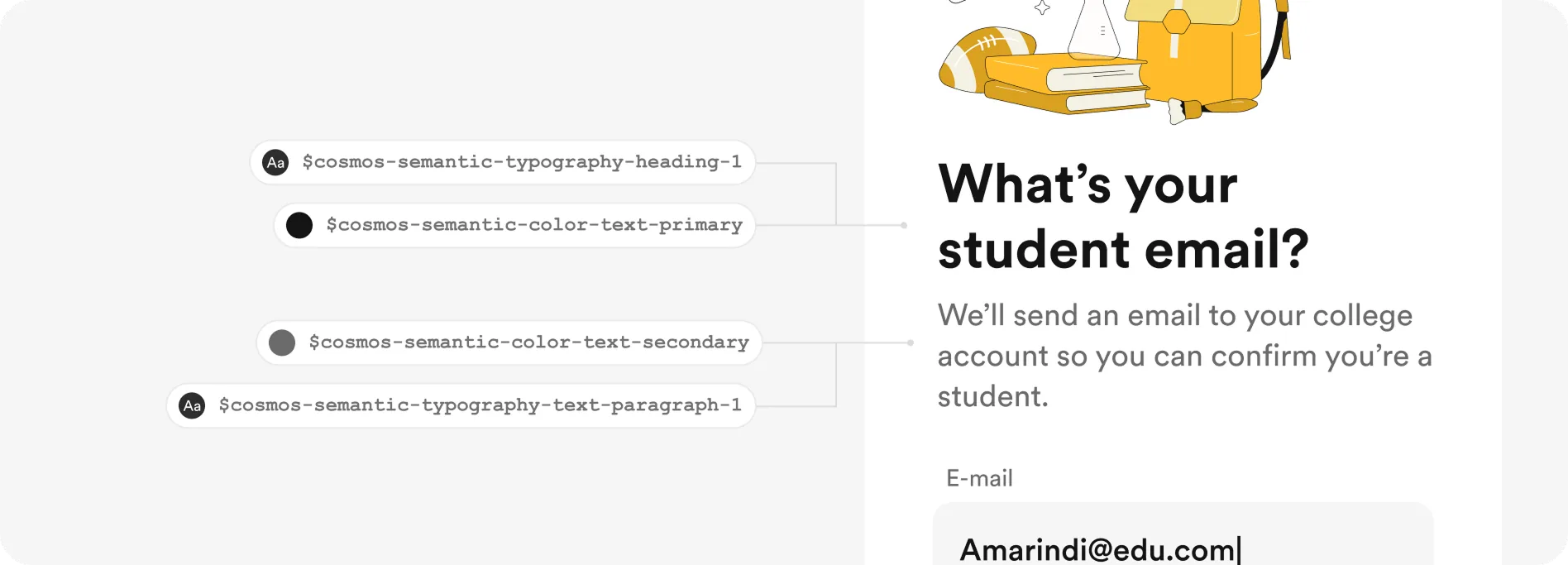
- A comprehensive system of design tokens to drive consistent color, typography, spacing, and radii across all platforms.
- Modular and themeable components designed for easy customization, ensuring they could flexibly adapt to future product needs while remaining brand-aligned.
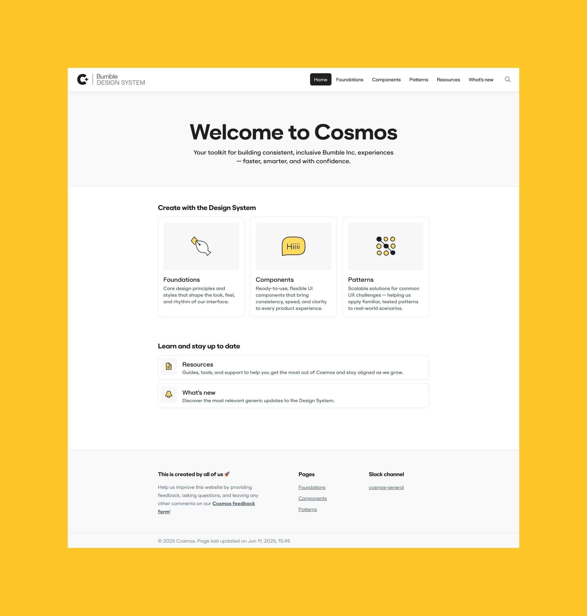
- Clear, concise documentation written for designers and engineers alike, with structured sections for usage, customization, accessibility guidance (including WCAG references), and component status.
- Close collaboration with engineering teams to validate the system’s readiness across iOS, Android, and web, ensuring a seamless developer experience.
- Regular feedback loops and workshops to support adoption and continuously improve the system as product needs evolved.
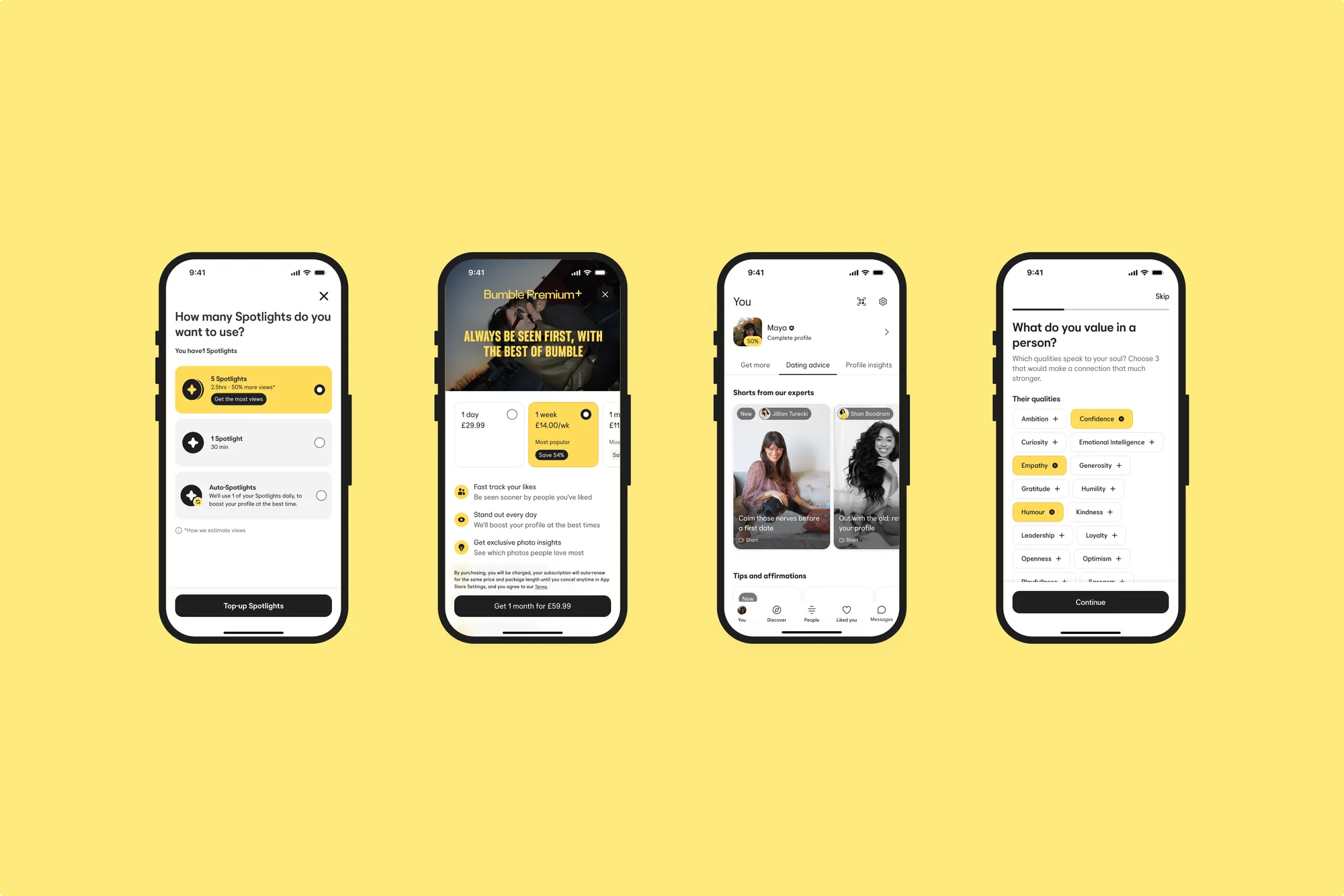
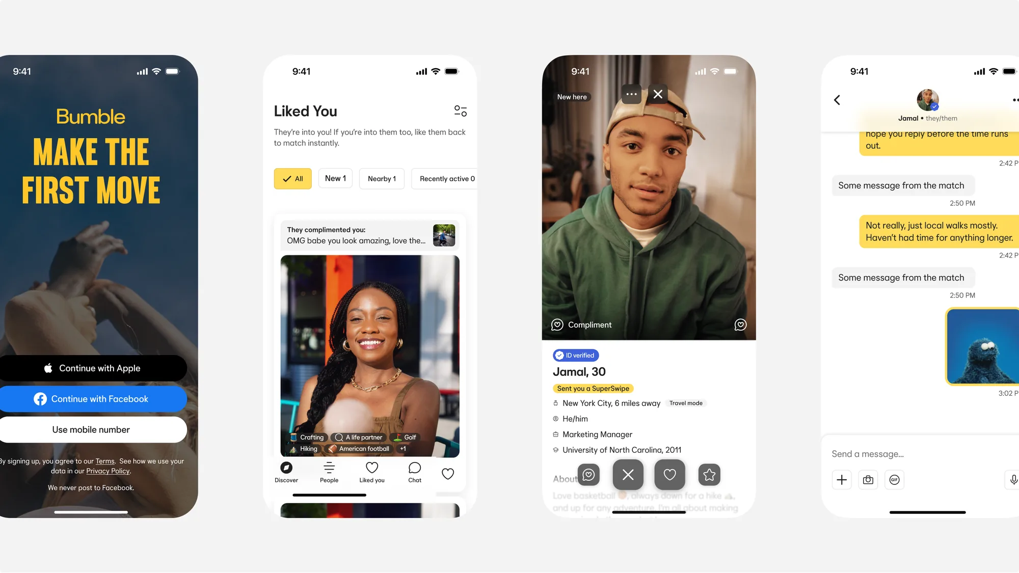
The impact of Project Love was transformative: it accelerated product development cycles, enhanced design consistency and quality, and provided a shared language that unified teams across disciplines. By embedding the refreshed Bumble brand throughout the system, we ensured that every product touchpoint felt cohesive, accessible, and distinctly Bumble (human, warm, and inclusive).
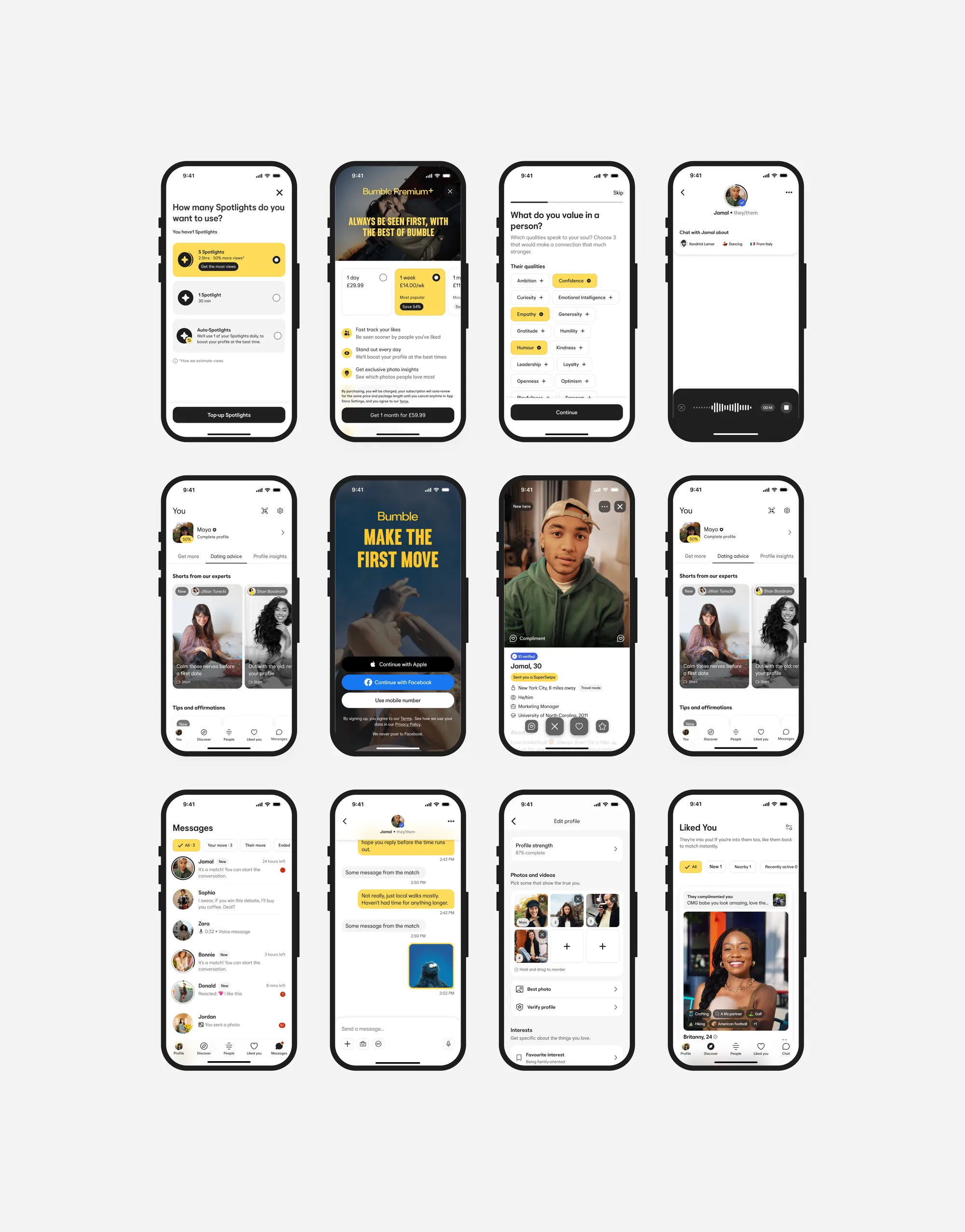
The impact
Project Love gave Bumble’s rebrand a system that teams could actually build with.
- The refreshed brand (human, warm and inclusive) carried through every component, with light and dark modes driven by tokens.
- A global token model (core, semantic and component tokens in Tokens Studio) that I helped introduce across the organisation, supporting all brands from one architecture.
- Shared documentation with accessibility guidance (WCAG) and component status, giving designers and engineers one common language.
- Adoption, usage and quality metrics that showed where teams needed more support and what to improve next.
- Bumble was recognised in the App Store Awards as part of the Trend of the Year, “Connection”.
What clients say
Real feedback from amazing clients I've worked with

“Thank you for all your hard work so far, we really are so happy working with you. You have brought our idea to life and it looks amazing, we always get compliments of how great the UI looks. Looking forward to carrying on the journey.”
CEO and Co-Founder @ Festy
Featured In
Some of the talks, workshops and creative explorations I've contributed to
Each experience is designed to inspire and foster innovation, showcasing my passion for design and collaboration.