Banco Santander
Helping scale Flame, Santander's global design ecosystem, so teams in every market could design and build banking products faster, with one shared language.
The challenge
Banco Santander operates digital banking products in many countries, each with its own teams, regulations and customer habits. Before Flame, those teams were solving the same interface problems separately, which led to inconsistent experiences and duplicated design and development effort. Flame started as a design system in Brazil and grew into the Santander Design Ecosystem: a global system with global brand elements and local components to solve local challenges, built collaboratively by more than 200 designers across 10 countries.
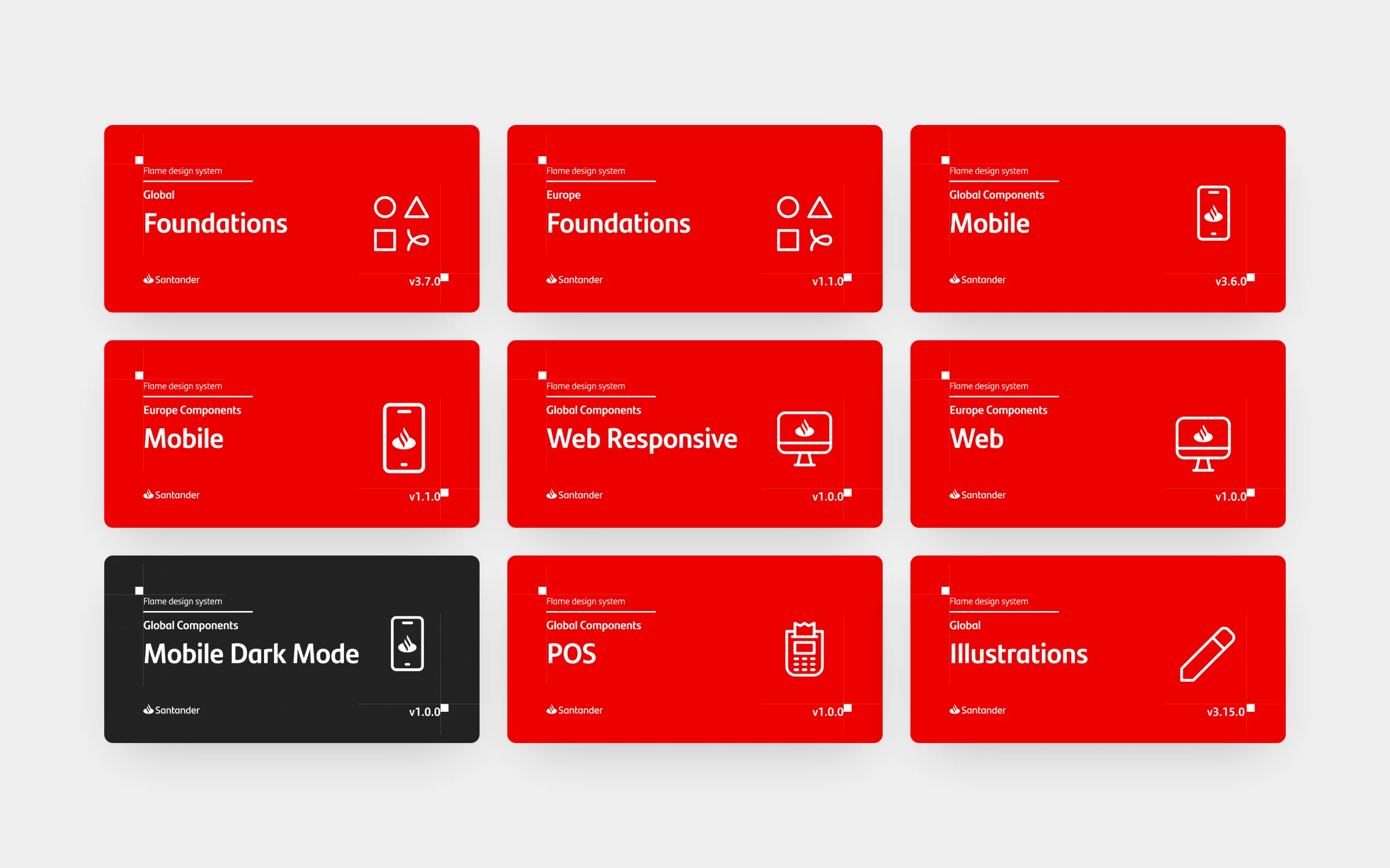
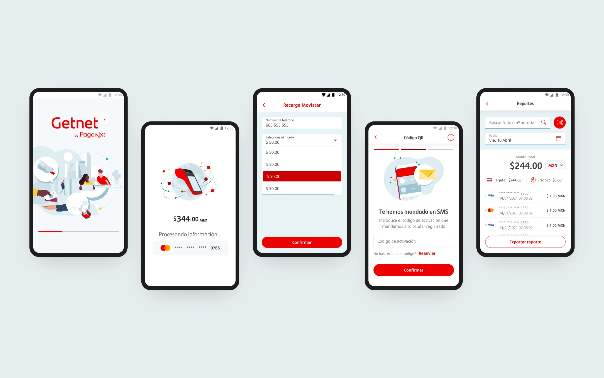
When I joined, Flame was already public and widely used. The challenge was keeping it coherent while it scaled: more than 1,780 reusable components had to stay consistent, accessible and easy to adopt for designers and developers working on iOS, Android and web, without stopping local teams from solving local problems. Flame was organised as a family of versioned Figma libraries: global and European foundations, plus component sets for mobile, responsive web, POS terminals and dark mode.
The role
Working at Sngular as a Systems Designer embedded in the Santander design team, I contributed to evolving and documenting Flame. My work included:
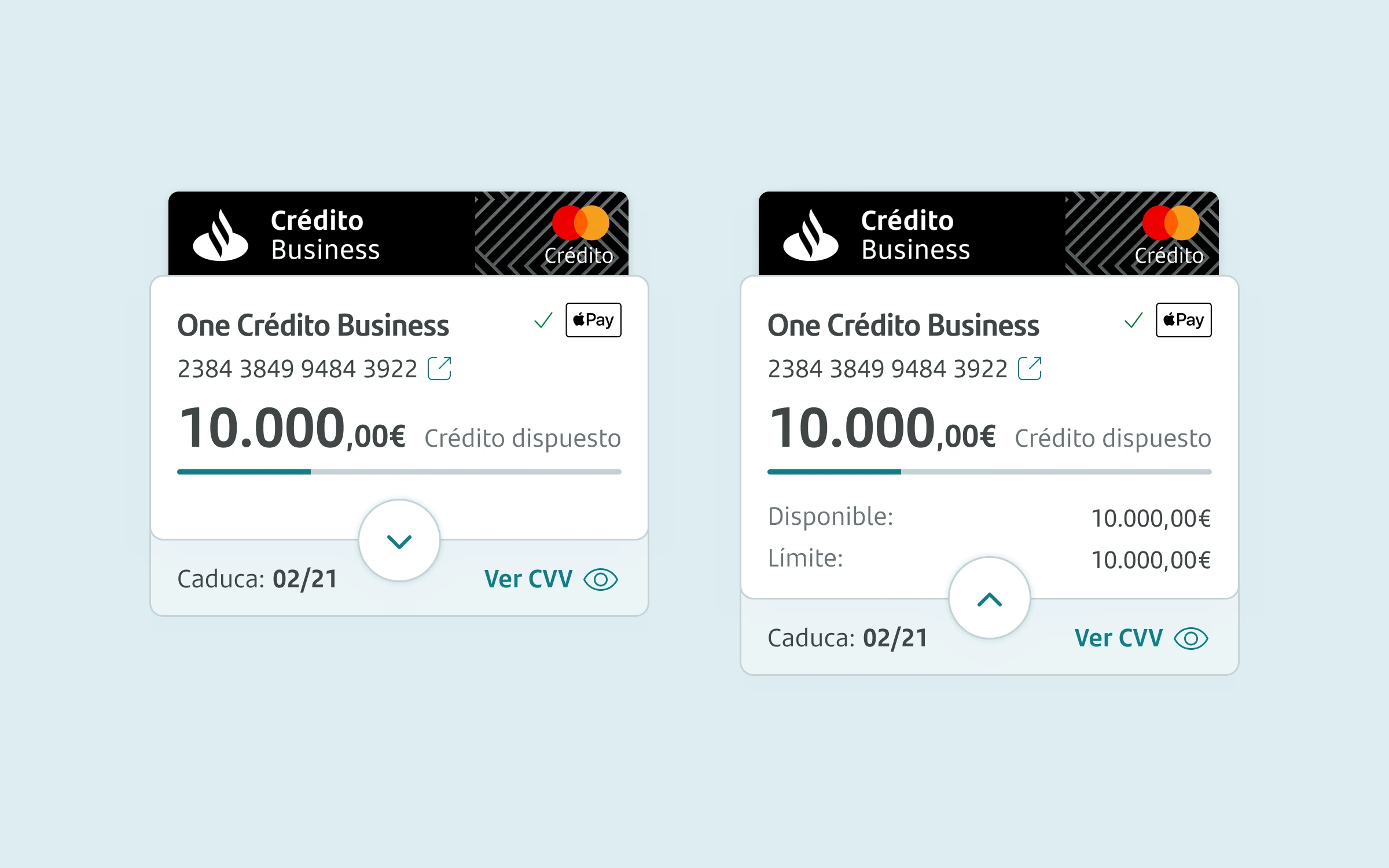
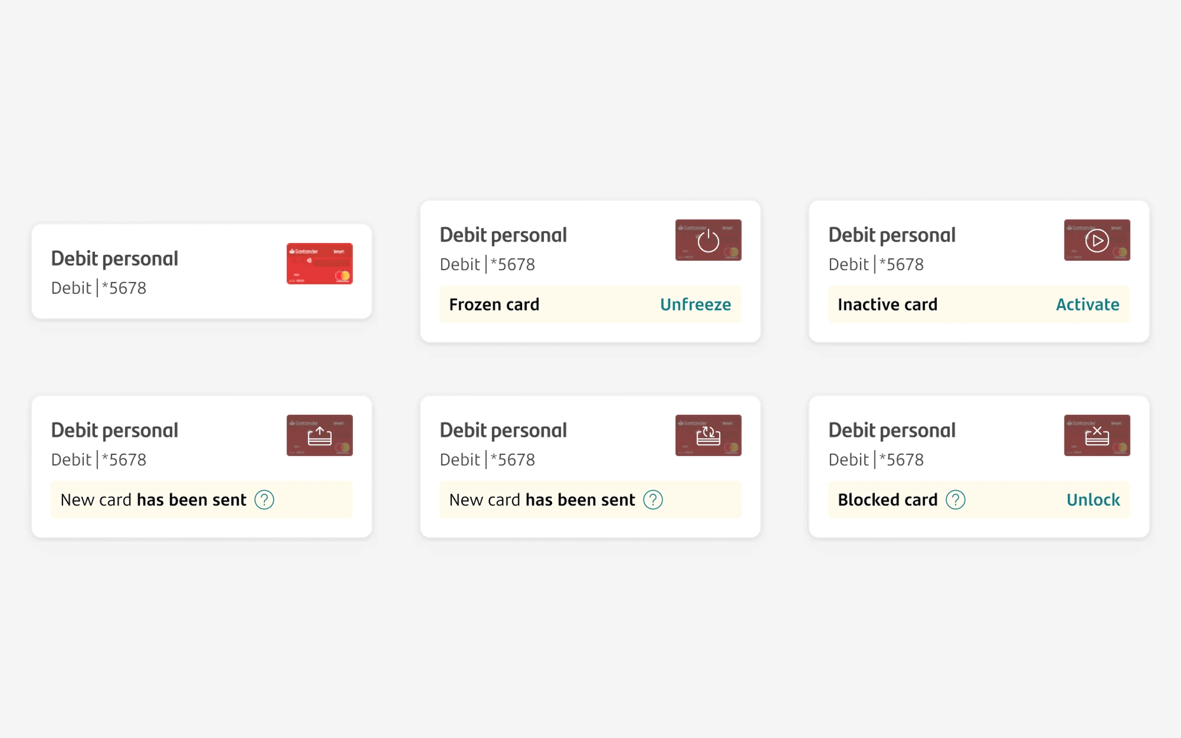
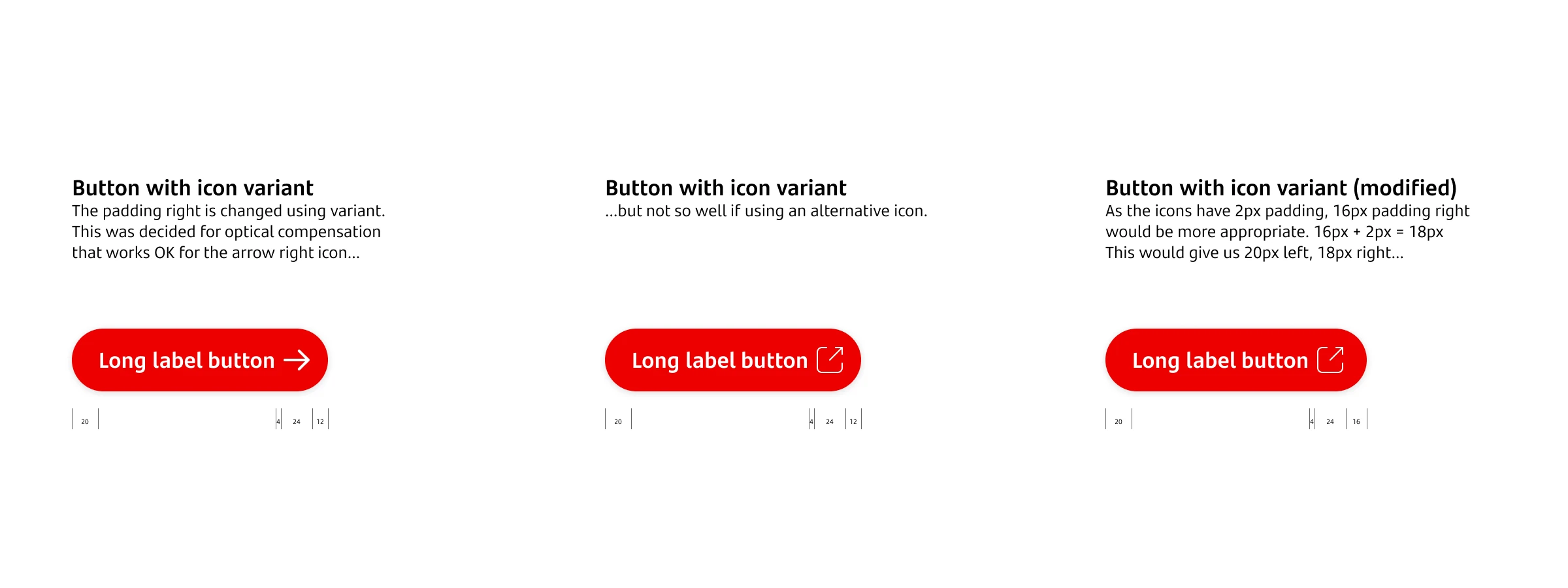
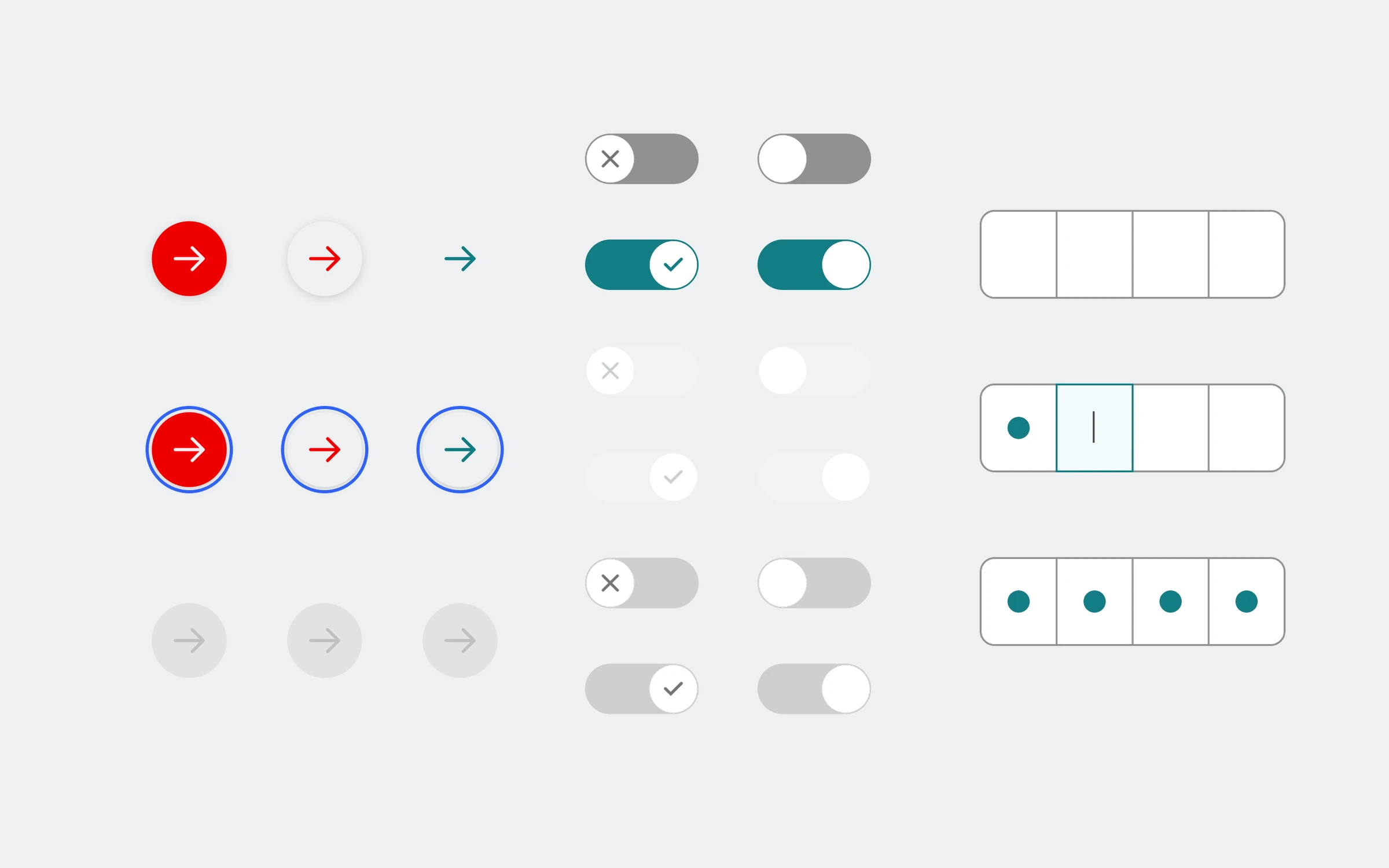
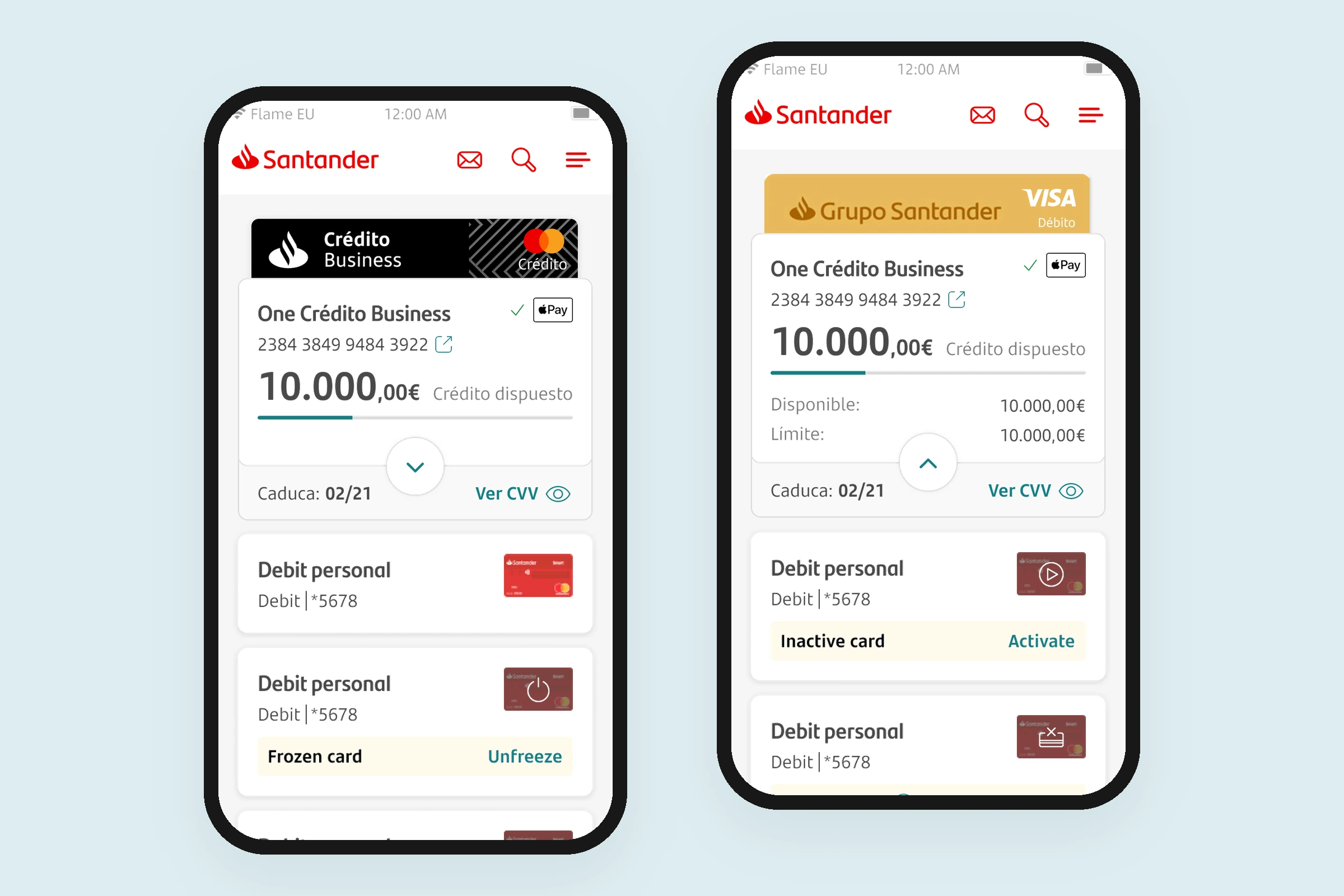
- Designing and maintaining core UI components for mobile banking, such as buttons, chips, list items, and product and credit card components, with consistent variants, states and properties.
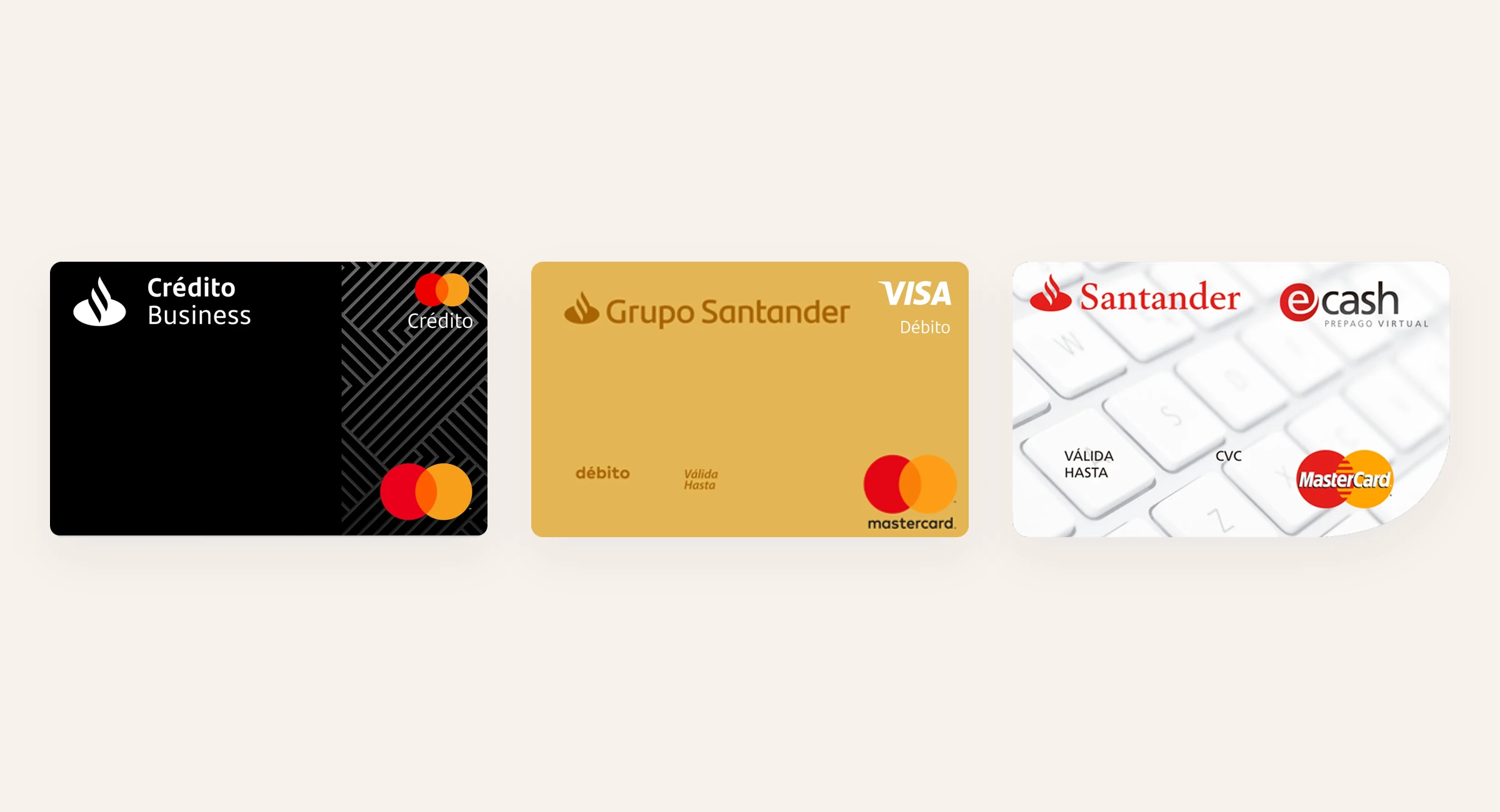
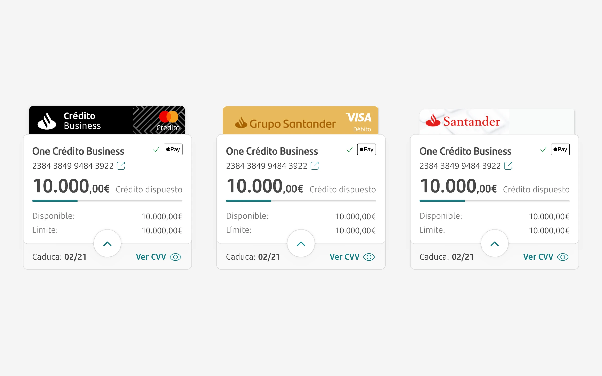
- Building component sets for banking-specific patterns, such as account and credit summaries, product balance and notification cards, transaction lists and the credit card catalogue.
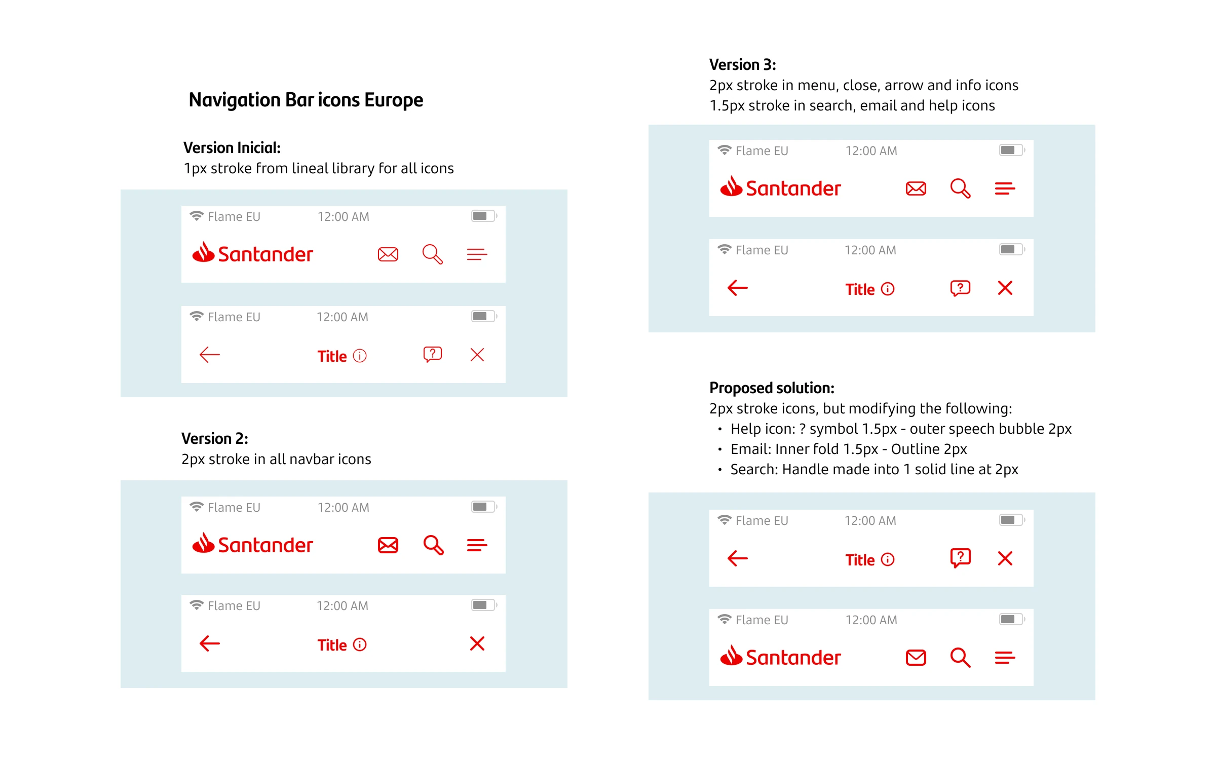
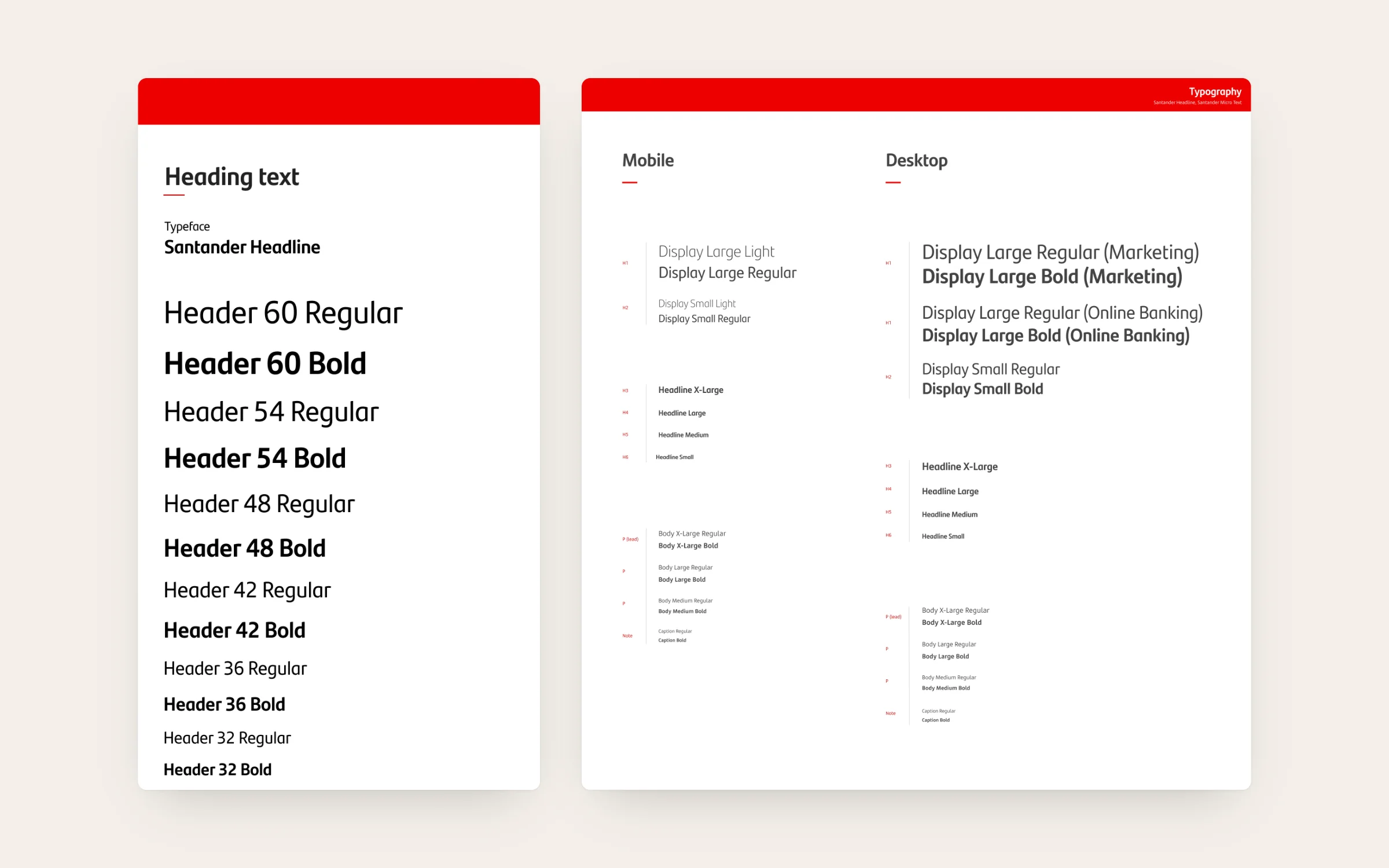
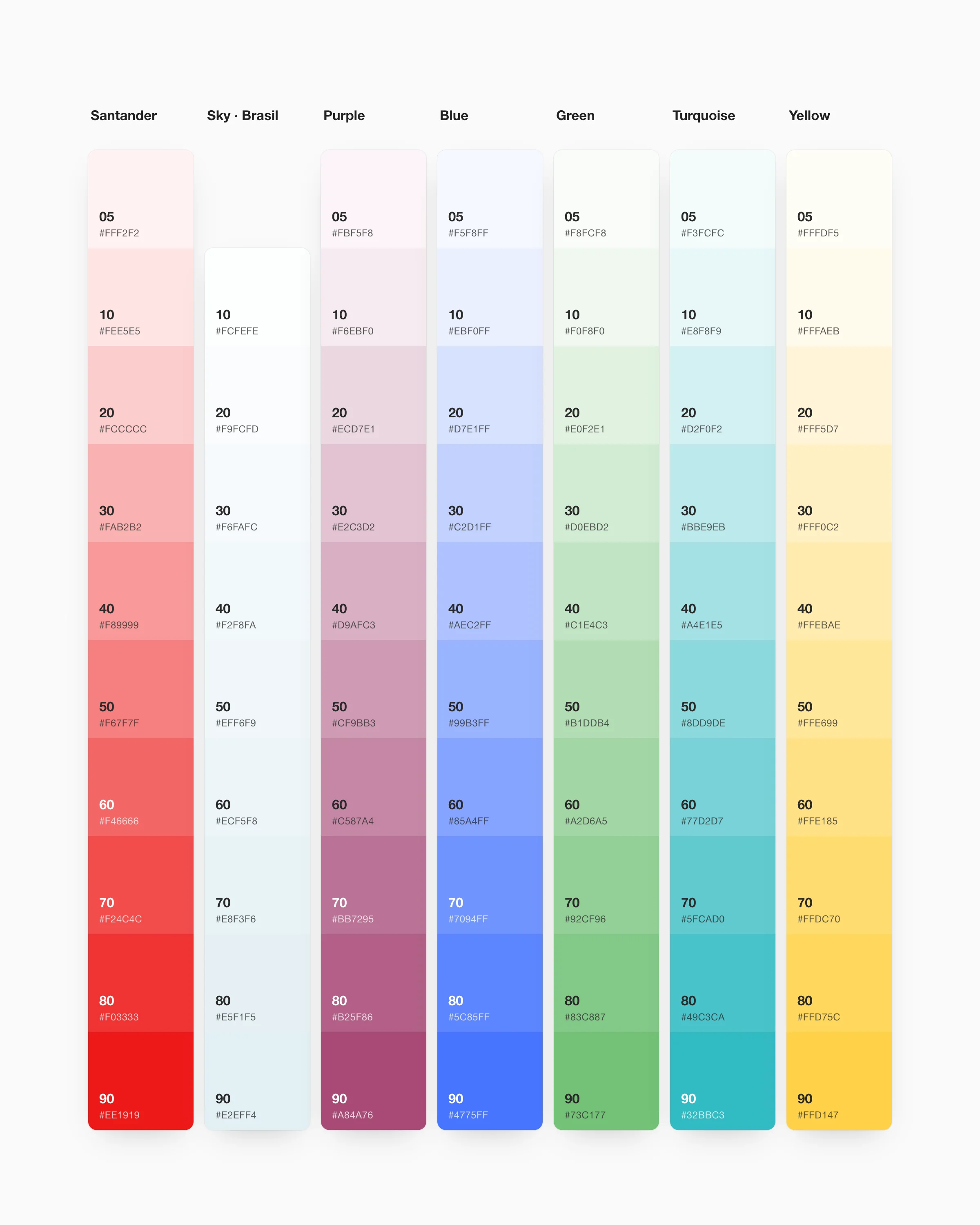
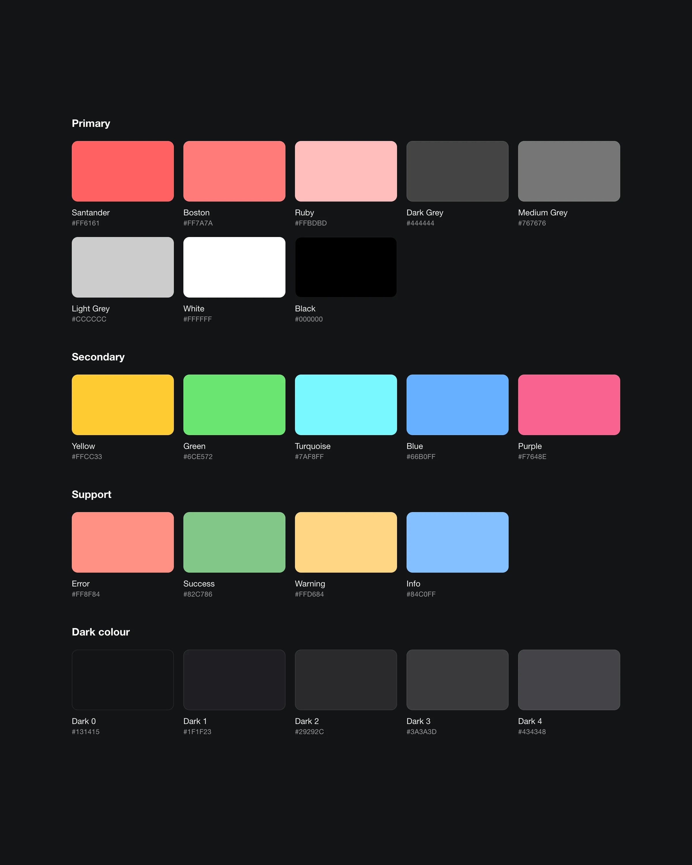
- Applying Flame’s foundations (colour, typography, spacing, iconography) and its global/local model, so components worked for the global brand and could be adapted for local markets.
- Writing and updating component documentation and usage guidelines for designers and developers, including accessibility guidance.
- Reviewing requests from product teams, auditing Figma libraries for inconsistencies and keeping design and implementation aligned with developers.
- Taking part in design-system rituals with Santander’s distributed teams, including reviews, critiques and the contribution process.
The solution
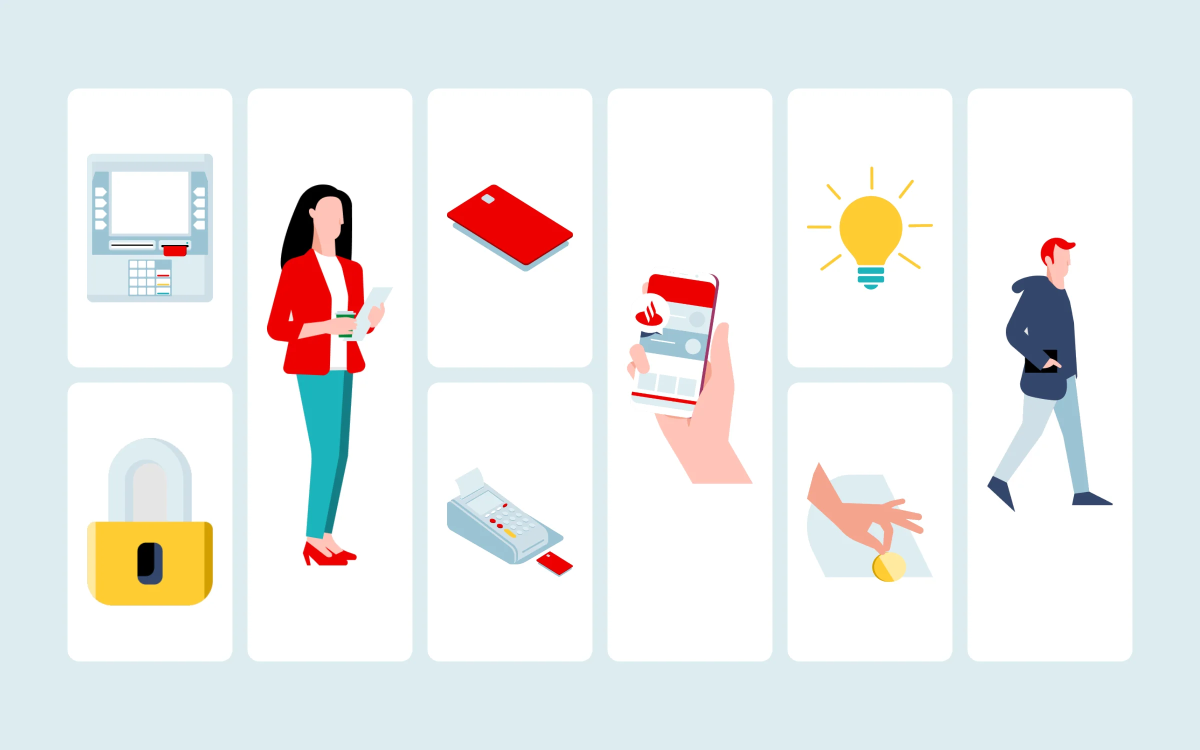
Flame is a design ecosystem rather than a single UI kit. Alongside its component library it offers an icon library, an automatic illustration generator, templates, colour palettes, typography and detailed accessibility guidelines, plus a Design Manifesto of nine principles that guides Santander’s designers worldwide. Its documentation was made public in October 2020, so designers and partners anywhere could browse and learn from it.
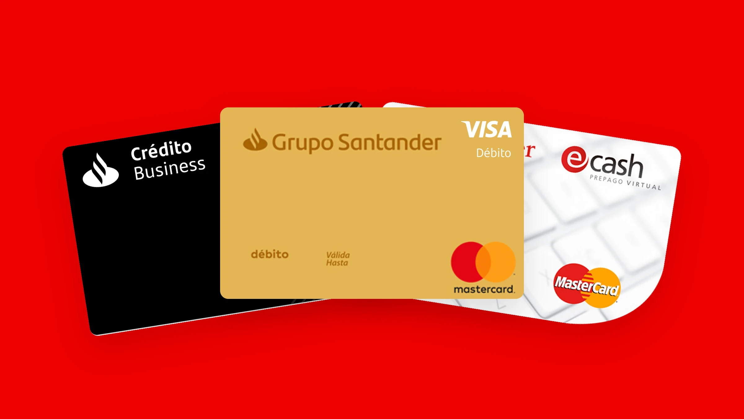
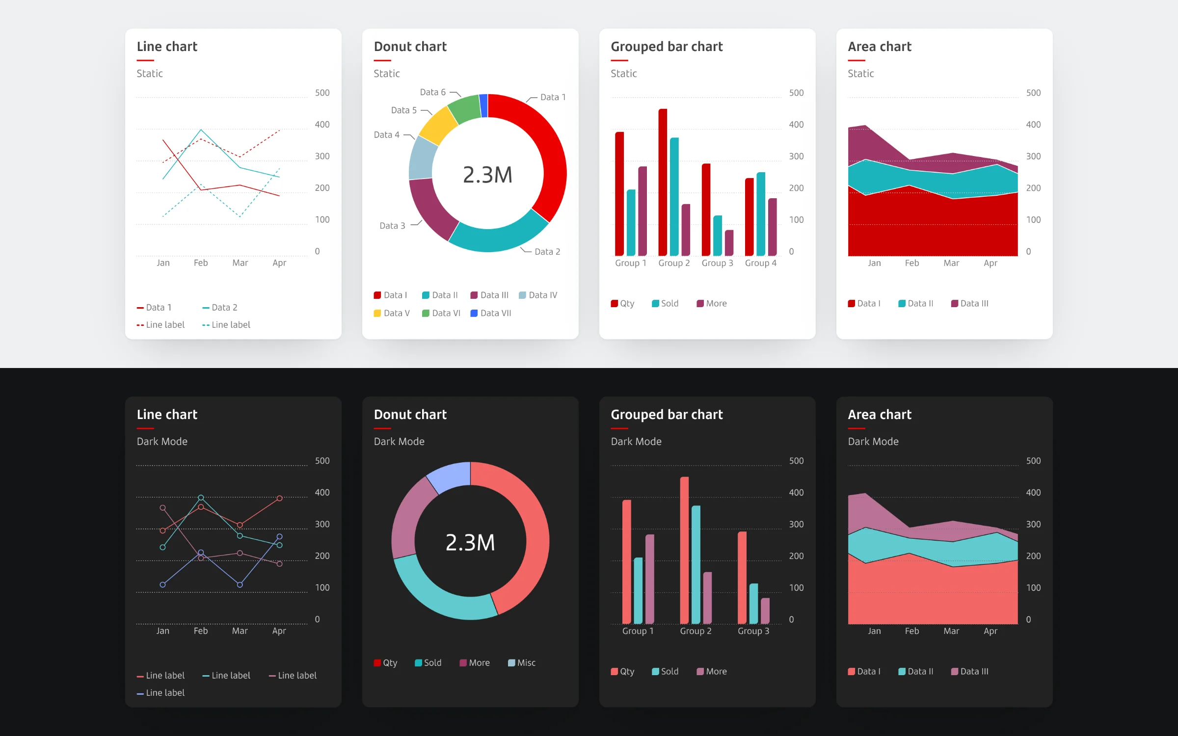
Within that ecosystem, our work focused on the components that power everyday banking: clear, reusable building blocks for showing money, products and actions. Credit and debit card components, account and product cards, transaction list items, chips and a complete button family were designed as flexible Figma components with consistent states and variants, so product teams could assemble screens quickly and predictably. The same components also had a dark mode version, with its own palette, and were complemented by data visualisation and illustration libraries.
Each component came with guidance on when and how to use it, its behaviours and its accessibility requirements, so that designers and developers in different countries could reach the same result without having to coordinate every detail. Shared global foundations kept the Santander brand recognisable, while the global/local model let markets add what they needed without breaking the system.
The result was a more consistent, better documented library that helped Santander’s teams spend less time rebuilding the basics and more time solving real customer problems.
The impact
- More than 200 designers from the Santander Group in 10 countries collaborated on Flame.
- More than 1,780 reusable components, plus an icon library, an automatic illustrator, templates, colour palettes and accessibility guidelines.
- Santander reported savings of about 35% in average development time for new mobile and desktop features.
What clients say
Real feedback from amazing clients I've worked with

“Thank you for all your hard work so far, we really are so happy working with you. You have brought our idea to life and it looks amazing, we always get compliments of how great the UI looks. Looking forward to carrying on the journey.”
CEO and Co-Founder @ Festy
Featured In
Some of the talks, workshops and creative explorations I've contributed to
Each experience is designed to inspire and foster innovation, showcasing my passion for design and collaboration.